Tuesday, March 16, 2010
Monday, March 15, 2010
Wednesday, March 10, 2010
Wednesday, February 24, 2010
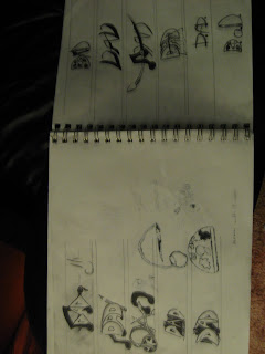
First I must say that I had a very difficult time with this project. Coming up with a ligature banner and business card and representing yourself is not exactly something you can whip up overnight to easily. It takes a long process to get to the point of its true completition. All of this starts with tumbnails, compositions, final compositions..and then the final work itself. I find that music and art are the two biggest things that i have a love and passion for. So I attempted to incorperate music using familiar symbols in music. The First Two innitials "D" and "A" are transformed to look like notes. The Las initial " D " was made to look like a paint pallet. To Finish it all off i threw in paint brush under the initials and added a music sheet style background.
Wednesday, December 24, 2008
Wednesday, December 10, 2008
Saturday, December 6, 2008
Tuesday, December 2, 2008
Sunday, November 23, 2008
Saturday, November 22, 2008
Wednesday, November 19, 2008
Sunday, November 16, 2008
Wednesday, October 29, 2008
Final layout

I created a hand drawn image of saint pauls church next to my old house on front street. After I photoshopped the font onto it, trying to give the color a redish tone because the church is that color however I chose not to color the church to keep that hand made look. The style I went for was Art Deco, So I gave the church a diagonal slant to give it that feel. I have always been a big fan of art deco because it doesnt seem so traditional to me but at the same time not to unorthadox
Sunday, October 26, 2008
Wednesday, October 22, 2008
Tuesday, September 30, 2008
Tuesday, September 23, 2008
My Project Evaluation!
Both of my designes have balance,proximity, variety, scale and proportion. I followed the rule of thirds pretty well i beleive, making sure i didnt plae my focal point smack dap in the middle, but put it up a little higher, lessening its value and moving it off to the side. As for the design principles, both projects are well balanced asymmetricaly or symmetricaly..there are good relationships and distance between each word which is a big part in why it is so succesfull, which is where proximity falls into place. The scale, proportion and variety share a similar relation ship, different sizes, proportions and fonts and values maintaing good realtionship and balance.
The elements of design i used were shape, space, color, size and typography. All of these affected how each word looked. which changes the design drastically, so i had to be very picky with where and how i placed the word as well as what it looked like. I have a strong beleive that i have found succes on some level. I beleive that both of my designes are eye catchers, meaning that most people would stop to look at them if noticed, even without color. I carefully have my focal points set up ready to make your eyes move from one word to the other, getting its point across. and that point is my enphasis on my five words which i turn into a sentence. Live Life, Love and Laugh and pursue Happiness..Very positive and very strong words. The choice of words can drastically change a design as well..would a word in big bold black words that says DEATH catch your eye or would LIFE, I beleive life would
The elements of design i used were shape, space, color, size and typography. All of these affected how each word looked. which changes the design drastically, so i had to be very picky with where and how i placed the word as well as what it looked like. I have a strong beleive that i have found succes on some level. I beleive that both of my designes are eye catchers, meaning that most people would stop to look at them if noticed, even without color. I carefully have my focal points set up ready to make your eyes move from one word to the other, getting its point across. and that point is my enphasis on my five words which i turn into a sentence. Live Life, Love and Laugh and pursue Happiness..Very positive and very strong words. The choice of words can drastically change a design as well..would a word in big bold black words that says DEATH catch your eye or would LIFE, I beleive life would
Monday, September 22, 2008
Subscribe to:
Comments (Atom)


